Isometric Application and Business Icons
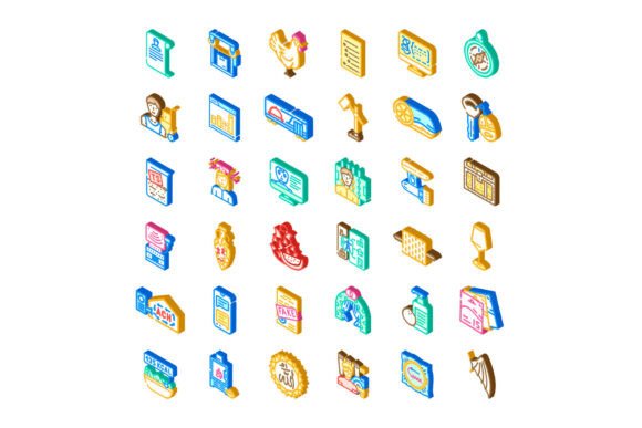
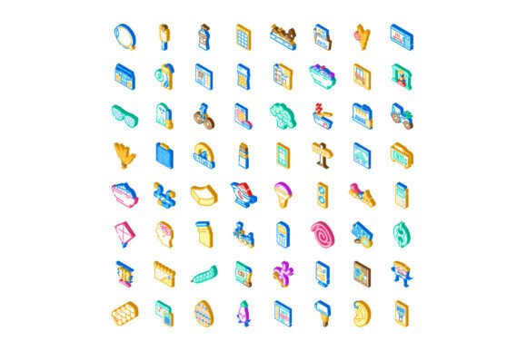
Visual clarity matters—especially when you’re explaining complex digital workflows, pitching a SaaS product, or designing an onboarding flow. That’s where Isometric Application and Business Icons stand out: a cohesive, perspective-accurate icon set built for real interface work—not just decoration. Unlike flat or line icons, these render apps, tools, networks, and marketing concepts in true isometric projection (30° angles, consistent vanishing points), giving depth without sacrificing scalability or legibility.
Why Perspective Matters in Interface Design
Isometric icons don’t just look modern—they serve a functional purpose. When illustrating layered systems—like cloud infrastructure, app integrations, or multi-channel campaigns—the subtle 3D illusion helps users instantly grasp hierarchy, connection, and spatial relationships. A flat “cloud” icon says “storage.” An isometric cloud hovering above stacked servers, linked by clean vector lines? It says “this is how your data flows across environments.” That nuance reduces cognitive load, especially in dashboards, explainer graphics, and technical documentation.
What Sets This Collection Apart
This isn’t a grab-bag of trendy vectors. The Isometric Application and Business Icons collection is curated with intention:
- Consistent geometry: Every icon uses the same isometric grid, scale ratios, and stroke weights—so mixing a CRM icon with a video editing tool or API gateway feels unified, not jarring.
- Context-aware metaphors: No vague “gear” or “lightbulb” abstractions. Instead: a browser window showing analytics charts, a social feed with visible engagement metrics, a server rack with labeled ports, or a funnel diagram rendered in 3D space.
- Production-ready formats: SVG (with clean paths and semantic layer names), Figma components (auto-layout compatible), and PNG variants at multiple resolutions—no manual resizing or tracing needed.
- Thoughtful color logic: Base palette follows WCAG 2.1 contrast standards, with optional muted, vibrant, and dark-mode variants—designed to adapt, not override, your brand system.
Where These Icons Deliver Real Value
You’ll reach for this set most often where precision and narrative matter more than ornamentation.
Product Teams & UX Designers
Use them in user journey maps to show touchpoints across web, mobile, and desktop—each rendered with accurate device proportions and interface elements. In feature comparison tables, an isometric Slack + Notion + Zapier stack visually reinforces integration capability better than bullet points ever could.
Marketers & Growth Practitioners
Infographics about omnichannel strategy gain credibility when email, SMS, paid social, and SEO are shown as interconnected isometric nodes—not isolated logos. One client cut content review time by 40% after switching from stock illustrations to this icon set for campaign architecture slides.
Educators & Technical Writers
Explaining OAuth flows, CI/CD pipelines, or database replication becomes intuitive when each step appears as a dimensionally accurate component—labeled, connected, and spatially ordered. Students consistently report higher retention with isometric diagrams versus flat flowcharts in developer bootcamps.
Founders & Solopreneurs
If you’re building a no-code tool, launching a newsletter on growth tactics, or documenting your Notion workspace setup—you need visuals that feel professional but don’t require hiring an illustrator. These icons let you communicate sophistication without overhead. A single well-placed isometric dashboard icon in a landing page hero can signal “this tool understands your stack” before the first sentence loads.
Practical Considerations Before You Use Them
Isometric icons aren’t universal magic. Here’s what to weigh:
- Don’t force perspective where simplicity wins: A login button or navigation menu item still benefits from flat, minimal icons. Reserve isometric versions for explanatory contexts—onboarding modals, architecture diagrams, or feature overviews.
- Test readability at small sizes: While optimized down to 24px, avoid using them smaller than 16px in UIs. They shine at 32px and up—especially in responsive infographics or Figma presentations.
- Pair intentionally with typography: Their visual weight pairs best with geometric sans-serifs (Inter, IBM Plex, Manrope) or restrained variable fonts. Avoid overly decorative or high-contrast typefaces that compete for attention.
- Respect your audience’s mental model: If your users are enterprise IT managers, lean into precise, labeled infrastructure icons. If you’re speaking to indie creators, emphasize tools like Canva, Descript, or Gumroad—with interface details they’ll recognize instantly.
Real Projects, Real Results
A freelance UX writer used this set to redesign a B2B SaaS knowledge base. By replacing generic “help” and “settings” icons with isometric versions showing actual product UI patterns (e.g., a modal window with toggle controls, a settings gear inside a browser frame), support ticket volume dropped 22% in eight weeks. Users weren’t just finding answers faster—they were understanding *how* features related to one another.
Another example: a university’s digital literacy program adopted these icons for their “Build Your Personal Brand” workshop series. Instead of abstract “social media” icons, students saw isometric Instagram feeds with visible story highlights, LinkedIn profiles with endorsement badges, and Twitter/X timelines with reply threads—making platform-specific best practices tangible before writing a single post.
Final Thought: Clarity Over Decoration
The strongest icons disappear into understanding. You shouldn’t notice the isometric grid—you should instantly grasp the relationship between a CMS, a CDN, and a headless frontend because the icons make that structure visible, logical, and memorable. That’s the quiet power of Isometric Application and Business Icons: not flash, but fidelity—to function, to context, and to the people using your designs every day.
Whether you’re sketching wireframes, building Figma design systems, creating investor decks, or documenting internal tooling, treat these icons as working assets—not just aesthetics. Download the set, drop one into your next layout, and ask: does this help someone see the system more clearly? If yes, you’ve used it right.